Kinwork
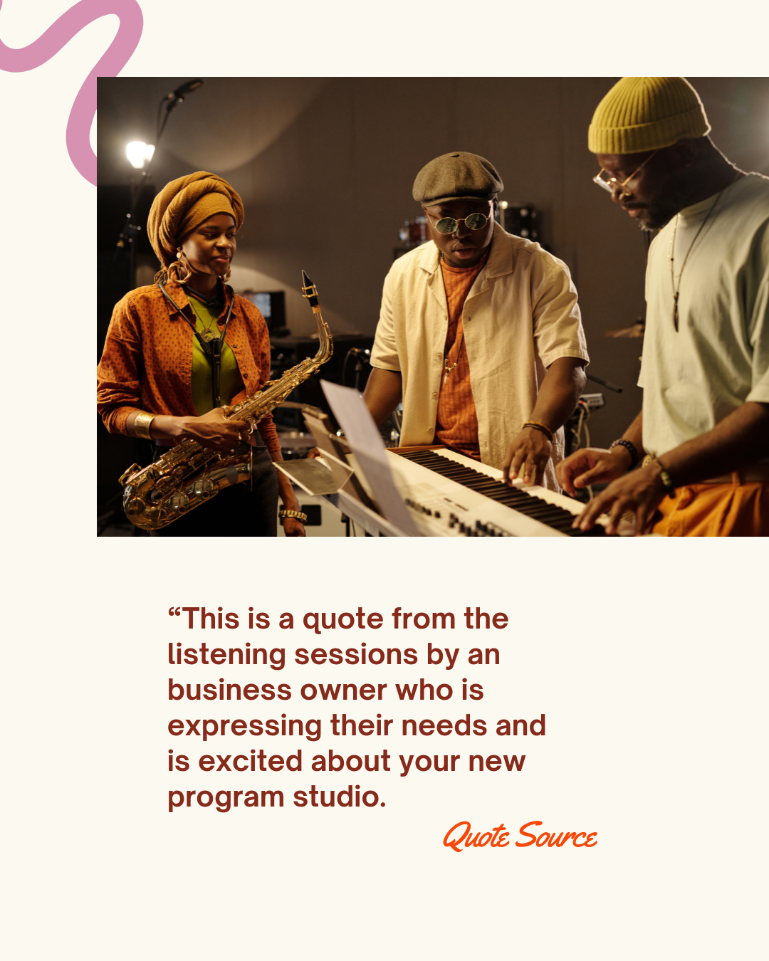
Founder Shaheen spent years watching brilliant entrepreneurs get left out of rooms that weren't built for them. Not because they weren't ready. Because the system was designed for someone else. So she built something different.
Kinwork is built for the person behind the business, not just the business itself. Built on the belief that when people can show up fully and build together, one person's win becomes everyone's win.
-
-
-
It all begins with an idea. Maybe you want to launch a business. Maybe you want to turn a hobby into something more.
-
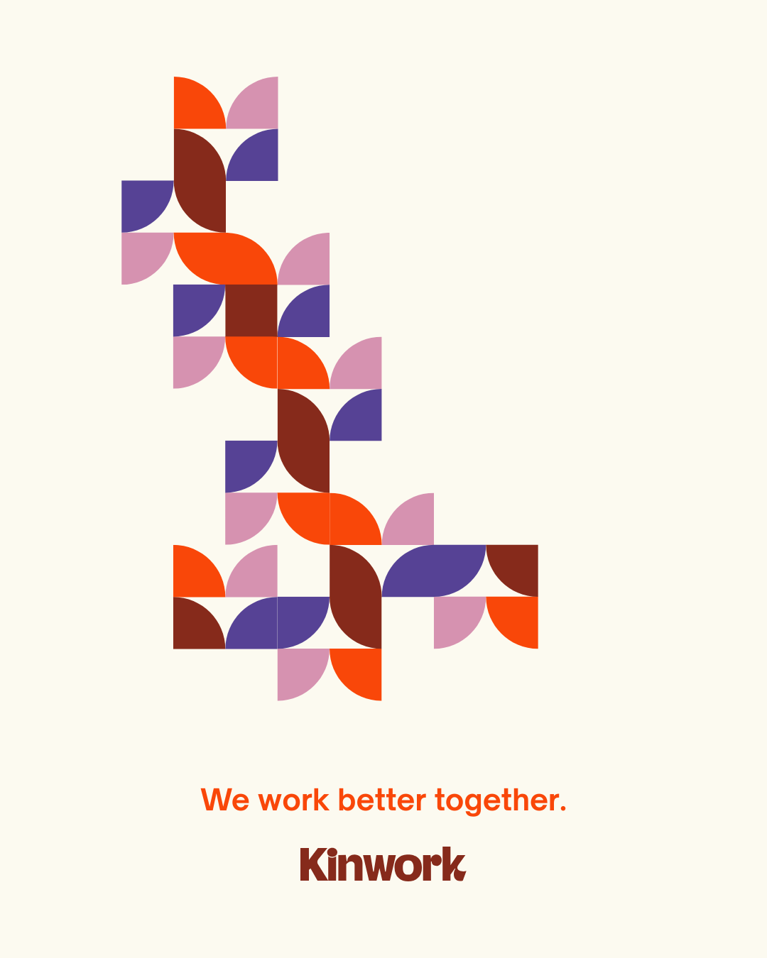
Kinwork’s visual identity is joyful and human, alive and ready for action, collaboration, and innovation. The logo type is a customized typeface that feels bold and confident; friendly and open; imperfect, yet polished. The brand mark is made of shapes that come together to form a cohesive ‘K’ emblem. It is simple, modern, a little retro, and easy to use across platforms. When linked together, the marks form a pattern or network of shapes, symbolizing the collaborative mission of Kinwork.